CASE STUDY FOR DR STOLZENBURG
Update Website
Dr Stolzenburg was not happy with his previous website. His major concern was visibility. After reviewing his site, several issues came to light. Introduction flash page, multiple logos used, lack of identity on inner pages, created in tables, inline styles and content not search engine friendly.
Dr Stolzenburg's Intro Flash Page (Old Website)

Introductory Flash (or "Splash") pages prevent the user from seeing the information immediately. It adds an additional click to "enter" the page. And more importantly, search engines recognize the home page being void of content.
Flash page was re-formatted and resized to fit on the home page. By just removing the introduction page which had no seo content, helped his ranking tremendously.
Lack of Branding and Identification

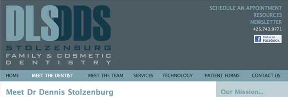
The Flash Intro page introduced you to the logo/branding. The home page had yet another logo. All remaining pages were "logoless." The solution was simple - Create the banner and repeat it on all subsequent pages.
If you have any questions or comments, please feel free to call me at 206.226.5421 or contact me via email.


