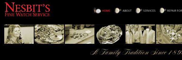
CASE STUDY FOR NESBIT'S FINE WATCH SERVICE
Update Website
Since 1895 Nesbit’s has stayed ahead of the game by combining quality products and professional service with smart business decisions. As premier watch making technology advanced, so did Nesbit’s skills, certifications and facilities.
Nesbit’s recently decided to expand their customer base and showcase their business nationally. The most cost-effective portal was their website. But, it needed technological updating to meet the needs of today’s search engines and a significant design upgrade to best represent the timeless beauty, style and sophistication of the watches they service.
Nesbit's Old Website
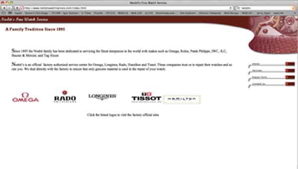
Nesbit's Old Website did not match the service, expertise and longevity that Nesbit's Fine Watch Service represented. In fact, their logo was not even used! The layout was "fluid", so when viewed on a larger monitor, two - three lines of text were displayed. This website did not convince the user of the precision involved in watch technology.
Photographs and Tone
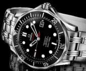
Watch and jewelery websites showcase shiny watches, silver or gold in color. When visiting a local jewelery store, they display their products on a black backdrop.
With this in mind, we had decided to use a black background in order for the watch photographs to "pop." With photoshop and illustrator, the images were manipulated with resulting in a faded reflection look.
Color Palette
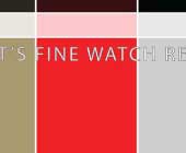
Going back to the jewlery store scenario, I decided to use only the red from their pre-existing logo and a gold tone representing the gold watches they service.
If you have any questions or comments, please feel free to call me at 206.226.5421 or contact me via email.
