CASE STUDY FOR GERALD L. BECKER, DDS
New Website
Dr Gerald Becker has known for some time that he would need an internet presence that would represent his knowledge, skills and over 25 years experience in the dental field. Dr Becker and I met, discussed his practice, his philosophy and his passion in the world of dentistry.
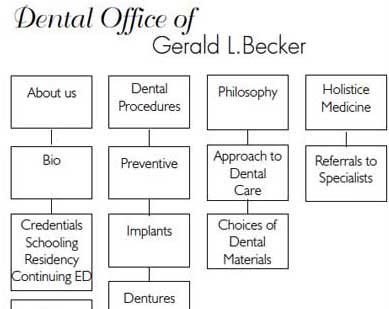
Information Architecture

Dr Becker was adamant about the content in his website - he has a wealth of information to share with his present/future patients as well as his colleagues.
By carefully organizing the content via an Information Architecture, we were able to view the website as a whole and ensure that the user experience would be positive.
Visual

Once the Information Architecture had been approved, the task at hand was to create a design that would communicate the professional services that Jerry provides his patients. With over 25 years of experience, my focus was on a clean design, a soothing color palette, and a quickly recognizable representation of the dental industry.
Once I had found a photograph of an x-ray, things fell into place. I used images for the top nav to allow for a shadow effect. The sidebar buttons were created in illustrator to portray more of a "high-tech" feel.
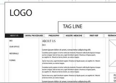
Wireframes

Once the Visual Design had been approved, the task at hand was to create a wireframe that would precisely position all the elements on the page and follow the guidelines set forth in the IA.
As a designer, I work on my design first, choosing my palette and creating a visual, and from the visual, I create my wireframe.
If you have any questions or comments, please feel free to call me at 206.226.5421 or contact me via email.


