CASE STUDY FOR HOPE CLINIC
Update Website
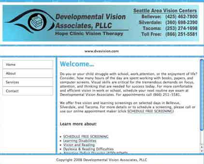
Hope Clinic's Old Website was not providing the information nor the image to the patients and potential patients. It lacked a message and the flow of information was non-existent. Two of their four pages were duplicate location pages.
My immediate task at hand was to research and learn what Vision Therapy was, and how it helped patients with their problems.
Information Architecture
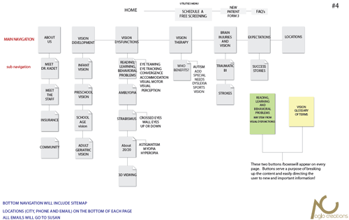
By carefully organizing the content via an Information Architecture, we were able to view the website as a whole and ensure that the user experience would be positive and navigationally easy.
It was imperative that anyone viewing at the website at a glance, would understand the flow of infomation. From the original site of 4 main pages, we expanded to 13 pages, plus subcategories.
Communicating to their Audience

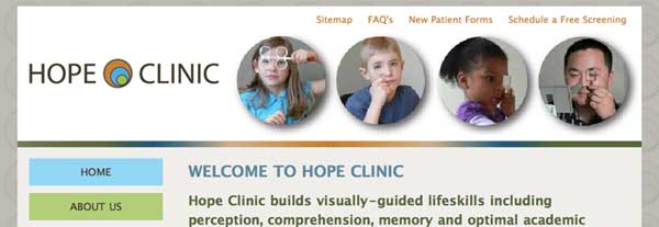
Once the Information Architecture had been approved, the task at hand was to create a design that would communicate the professional services Hope Clinic provides their patients. With 80 percent of their clients being young children, I had requested photographs of children using Vision Therapy tools. With photographs in hand, (and with the help from photoshop and illustrator), the banner photographs were framed in circles, mimicking the logo.
Embedding their Video
To provide additional information in a video format, their video was updated and uploaded to YouTube, then embedded on their website.
Marketing Hope Clinic's Website
Hope Clinic understands the importance of marketing their website, spreading the word, etc. Their first newsletter is live and they will start a library of newsletters that aids in the overall SEO and shows their audience their expertise in their field. A blog is being developed to further market their website.
For more information regarding marketing your website and SEO (Search Engine Optimization), please check out our SEO/Marketing Page.
If you have any questions or comments, please feel free to call me at 206.226.5421 or contact me via email.
