CASE STUDY FOR THE CREATIVE CORNER
Update Website
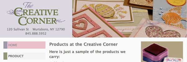
The Creative Corner's old website was created via the "Build your own website packaged templates".
The Creative Corner's Old Website (via Kit)
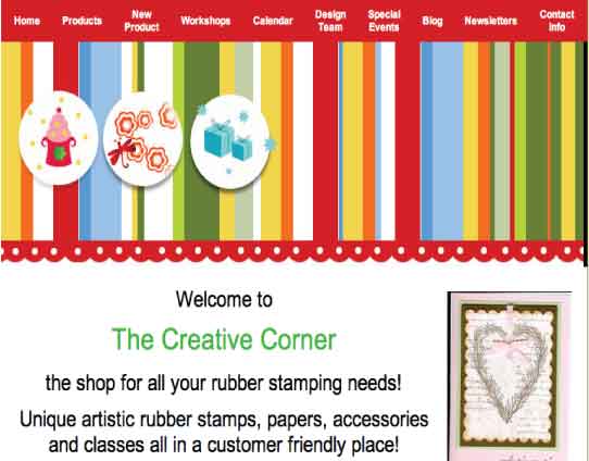
Unfortunately for the business owner, the "Build your own Website Kit" was limited in visuals and lacked typographic style.
Images were not optimized for the web, (longer downloading time) and were displayed disporportionately (stretched). The original site did not portray the professionalism and individualism that the owner brought to her craft.
Lack of Branding and Identification
The "kit" did not offer any sort of branding for the rubber stamping shop. In fact, the distinct logo was absent from the original site.
Solutions
- Gathered all the artwork (logo and cards) and established a color palette that was representative of the rubber stamping craft.
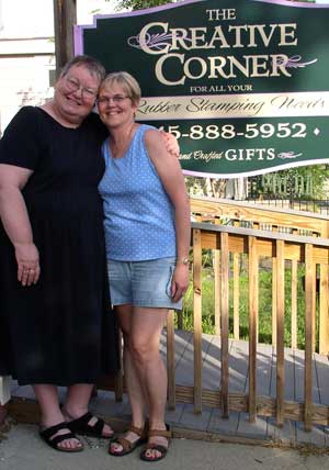
- Personalized website with pictures of the owner.
- Used lightbox effect to display the intricate details of the cards.
- In order to strengthen the Creative Corner's SEO ranking, an accordian slide was created to display her older newsletter emails, adding relevant content, but not destroying the "look and feel" of the site.
- This was also accomplished in the Press page by hiding content with javascript and in the Designer's page by listing products and displaying them only when "mousing over" the image.
If you have any questions or comments, please feel free to call me at 206.226.5421 or contact me via email.
