Staging Area for the upcoming Website for Dr Kageyama
The Staging Area represents an accessible setting for all documentation and contact information pertaining to the design and developement of the website for Dr Kageyama
Stage 1 - The Information Architecture
Tips for well built websites
- Content
- Links between pages
- Links to YOUR website
- Writing for SEOs and humans!
- Chunks of information with relevant headlines and subheadlines
- Photographs that tell a story - good composition, good lighting, in focus and correct size
-
Regarding size - bigger is always better - Bigger images can be resized to smaller!
Information architecture boils down to consciously organizing the content and flow of a website - Basically, it is the blueprint for your website!
A good Information Architecture always keeps the user experience and user interface in mind. What interests your user? What is important to your user? What information is your user looking for? Ease of navigation - does the navigation makes sense?
Our first version for the Information Architecture. Please note that this is a work in progress.
Our SECOND version for the Information Architecture. Dr Kageyama, while reviewing the first version of our "blueprint," I realized I needed to move things around, as well as highlight other items. As mentioned earlier, it is a process!
Our THIRD version for the Information Architecture. Dr Kageyama, a few final additions to enhance your SEO.
Your logo
Dr Kageyama, your logo must communicate to your audience your expertise, professionalism and identity. Due to the fact that 90% of your patients are children, the ABC building blocks were added to your name /practice name. Your name must be easily recognized, while your practice creates a nice contrast. I have used welcoming "child-friendly" colors.

The Wireframes
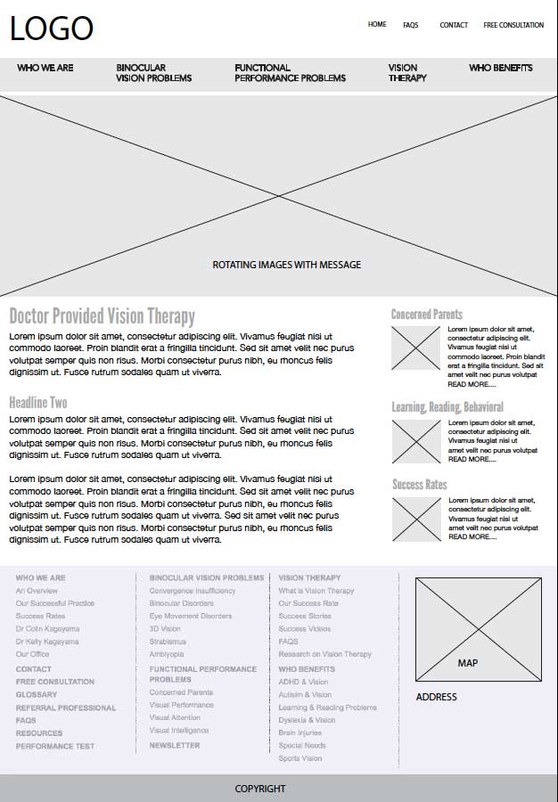
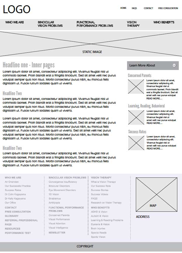
The wireframe will show you the placement (and functionality) of assets, including navigation, text, images (box with an "x"), buttons, rss feeds, etc.
The Comps
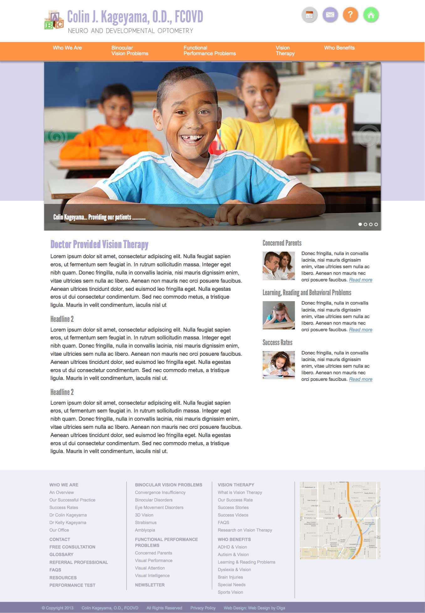
From the wireframes, the "comps" are created, showing images and color palette.

Rotating images for the home page
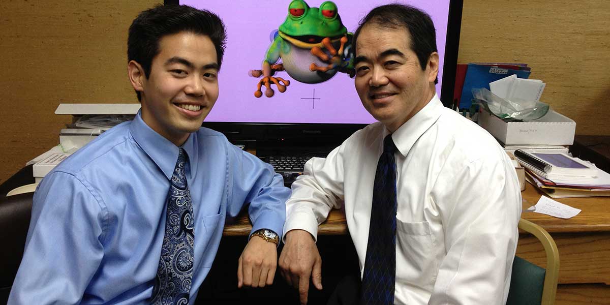
Dr Kageyama, due to 90% of your practice is made up of children, I found these images would work nicely on your home page, as well as your photo!


